The Power of Paint
Paint never goes out of style. It’s the easiest way to transform a room, and there’s always a current color to make it feel now even though it’s really always.
In the last year, we’ve been picking up the roller more than ever: Sherwin-Williams’s sales grew 9 percent in the fourth quarter of 2020, while Farrow & Ball saw a 35-percent increase in sales over the past year. And it’s not just your standard eggshell, four walls, floor to ceiling.
Designers and homeowners have been getting creative with decorative treatments, formulations, and fresh approaches to color. Here are five ideas that we’re loving right now.
The New Feature Wall: The Ceiling
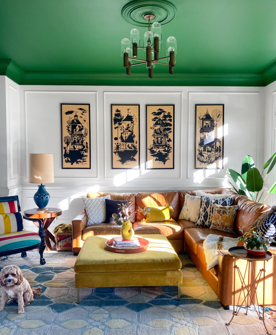
The fifth wall is finally getting more than a coat of “ceiling white.” Decorators have discovered that what’s overhead offers an opportunity to introduce color in a big way while leaving the walls and the decor alone. “A painted ceiling can give a space life,” says designer Natalie Papier, founder of Home Ec., a design firm based in Charlotte, North Carolina. Don’t be afraid to go bold with your color choice, says Papier, who topped her living room with an eye-popping matte green. If your ceilings are less than nine feet, don’t go too dark, she cautions, unless you’re aiming for a cozy, moody vibe. A colored ceiling can get heavy quickly.
The New Wallpaper: Macro–Color-Blocking
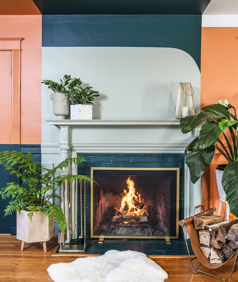
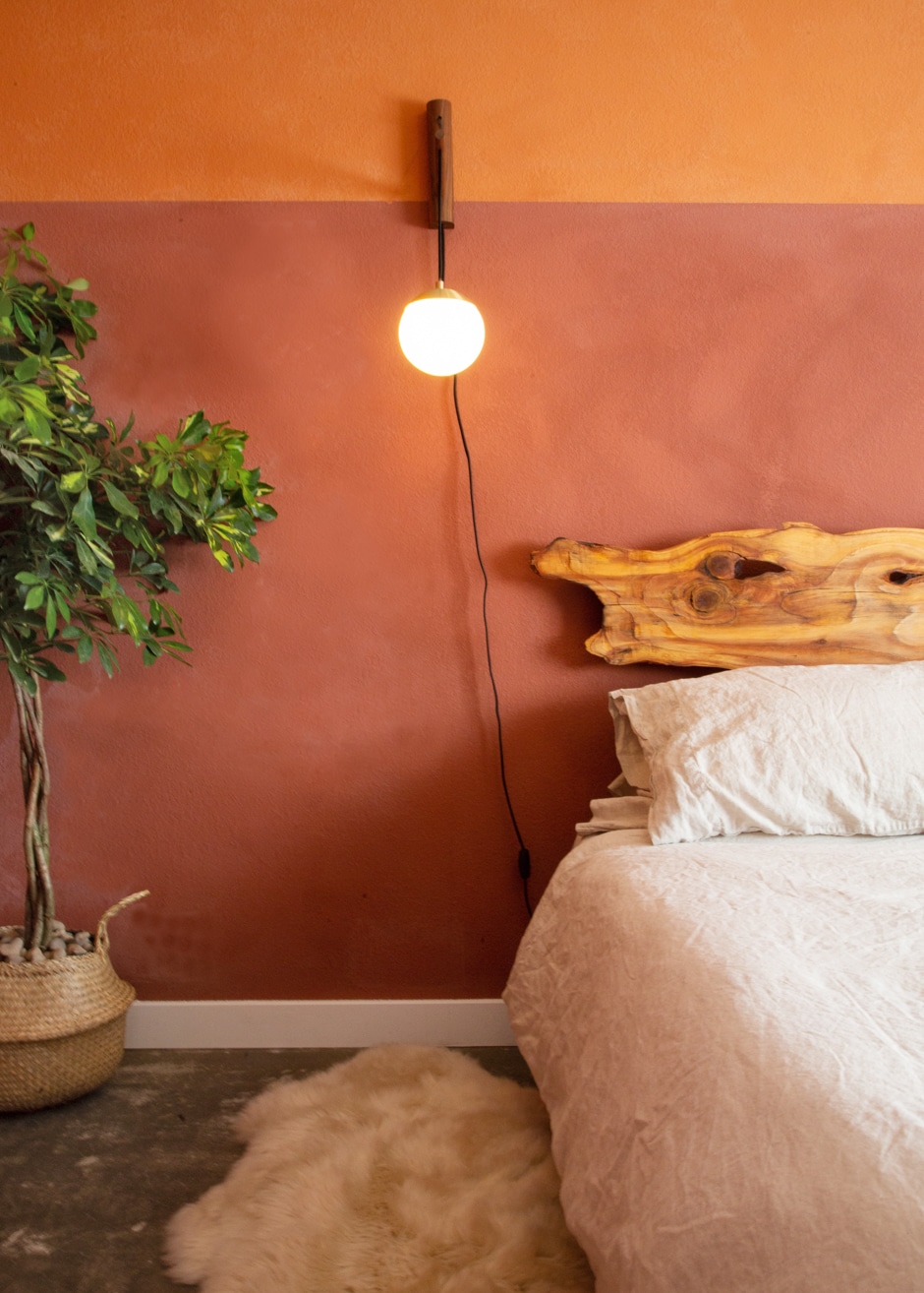
What’s a painterly alternative to wallpaper, only less pricey and labor-intensive? Wall-to-wall color-blocking. Hilton Carter, a Baltimore-based stylist and author known for his plant-filled interiors, made over his living room in a palette inspired by plants and terra-cotta. “It was a great way to break up the symmetry of the room,” he says. “It makes the room feel more exciting. The entire wall becomes art.” If you’re experienced at painting interiors, you can probably DIY something like this. If not, an ambitious design may be best left to the pros.
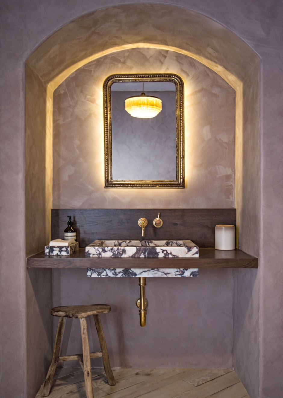
The New Focal Point: Architectural Detailing
Got a cool archway or adjustment that wants a little flair? Adventurous designers are highlighting these architectural moments in delightful ways, painting them in a contrasting color to the rest of the room to catch the eye and add drama and playfulness. Tempted to try it? Look at the structure of the space, advises New York–based interior designer Josh Greene. “See what the architect was making a gesture with and ask yourself, ‘Does it deserve an additional layer?’ ”
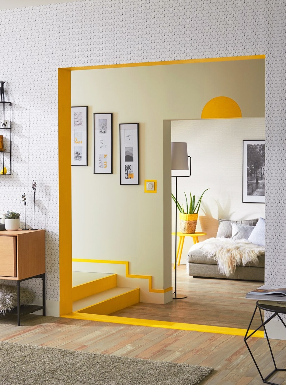
The Direct Painting Group, an interior design firm in London, used Sweet Lemon by Valspar to highlight an entry hall. With just a little paint, the stair risers, baseboards, and threshold go from ordinary features to a warm and bright room outline.
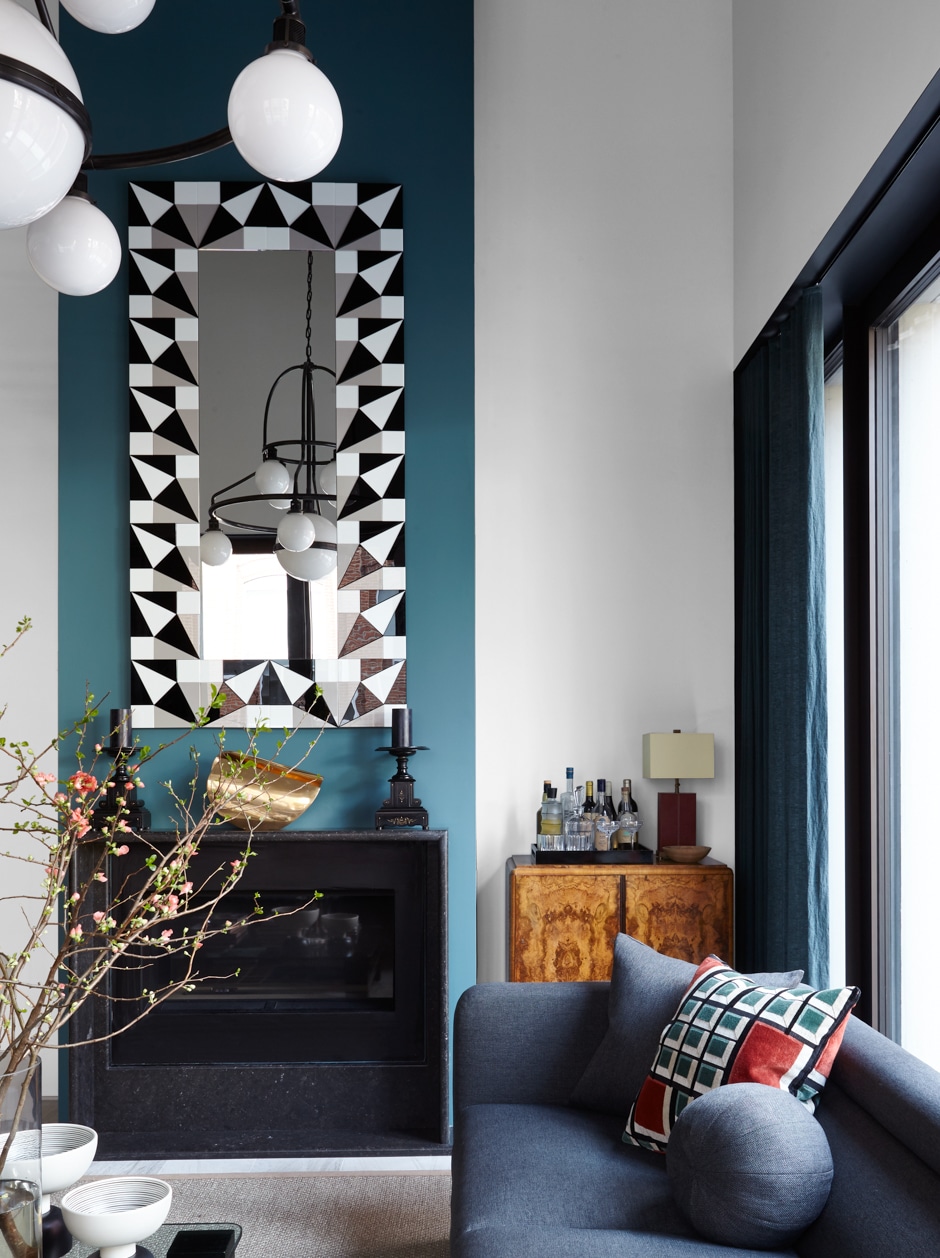
In a client’s living room, Greene highlighted the double-height chimney column with Fair Isle Blue by Benjamin Moore Aura. Whereas painting it in the same color as the rest of the walls would have made it disappear, the contrast makes the column stand out visually.
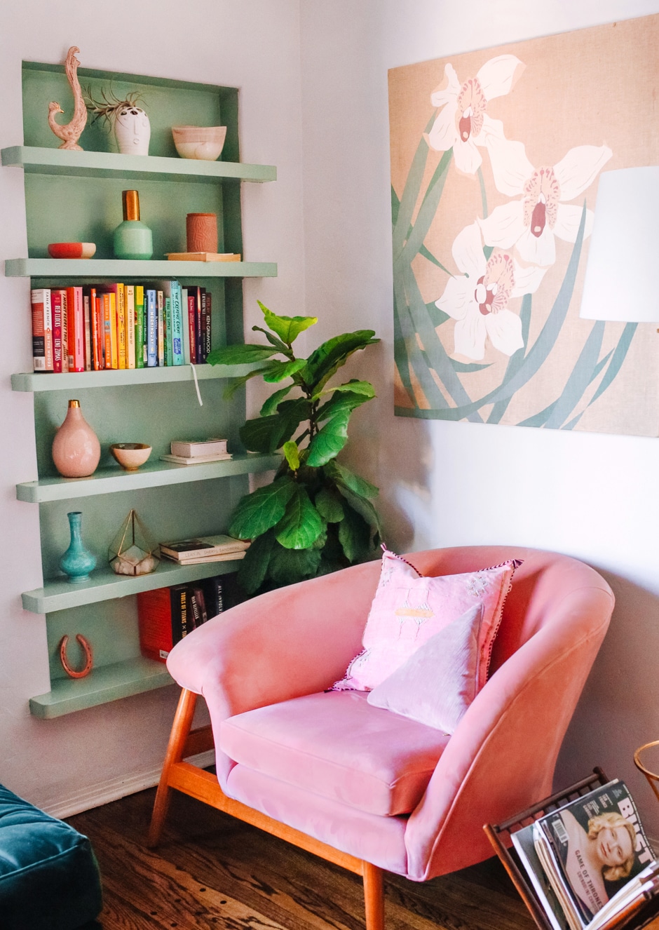
Color wakes up the built-in bookcases in designer Dani Nagel’s Los Angeles apartment. “The built-ins were so beautiful but you hardly noticed them when they were just white,” says Nagel, who used Pistachio Shell by Dunn-Edwards. “Color really did the trick to highlight them and update the older building. It adds a freshness.”
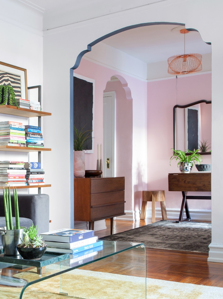
A coat of Soot by Benjamin Moore accentuates the decorative arch that divides the foyer from the main room of designer Linda Cava’s Brooklyn apartment.
The New “It” Paint: Limewash
It’s rare that the paint formulation itself has designers swooning, but when it does, get ready for it to be everywhere! Lime paints are typically used on porous exterior surfaces, like stone, but a new crop of limewash coatings are meant to be used inside on previously painted surfaces and drywall, adding texture and interest, according to Jamie Davis, cofounder of Portola Paints & Glazes. We love how they give color a weathered, lived-in look and bring subtle drama to a space.
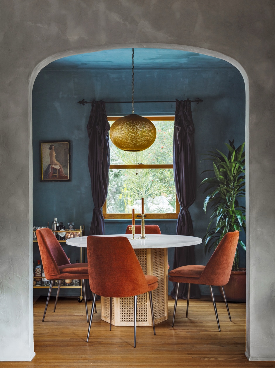
Tiffany Howell of design firm Night Palm went all in with color in this dining room, using Wellfleet by Portola limewash on the walls and ceiling to give the space some serious drama. “I especially like the way the light bounces off the wash to create a lushness that gives the room a romantic feel,” says Howell.
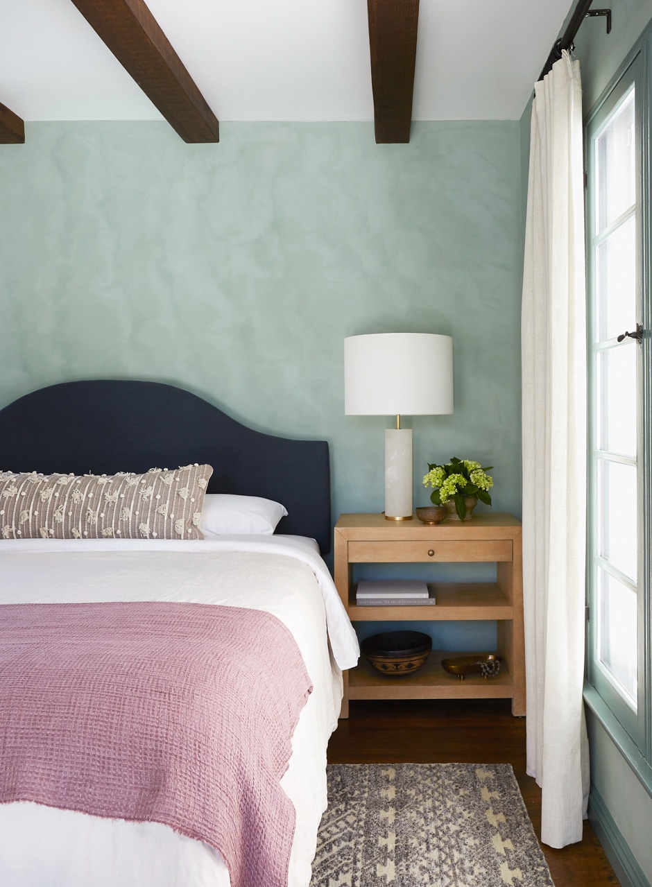
Shaun Crha of Wrensted Interiors used a soft aqua (Rococo by Portola) to create this calming bedroom. “Instead of working against the less-than-perfect plasterwork in an older home, limewash works with it, enhancing that soulful, old-world quality,” Crha explains.
For this bold, desert-inspired bedroom, Los Angeles–based design firm West & Wild paired pumpkin and rust hues using Merida and El Coyoté by Portola. “The limewash’s texture created a sense of cohesion between the two colors,” says Eric Bach, a partner at West & Wild.
In this moody sink area, designer Jake Arnold used Simmer Down by Portola floor through ceiling to create a cocoon vibe that still felt minimalist. “Limewash allows a space to feel covered without heavy layering,” Arnold says.
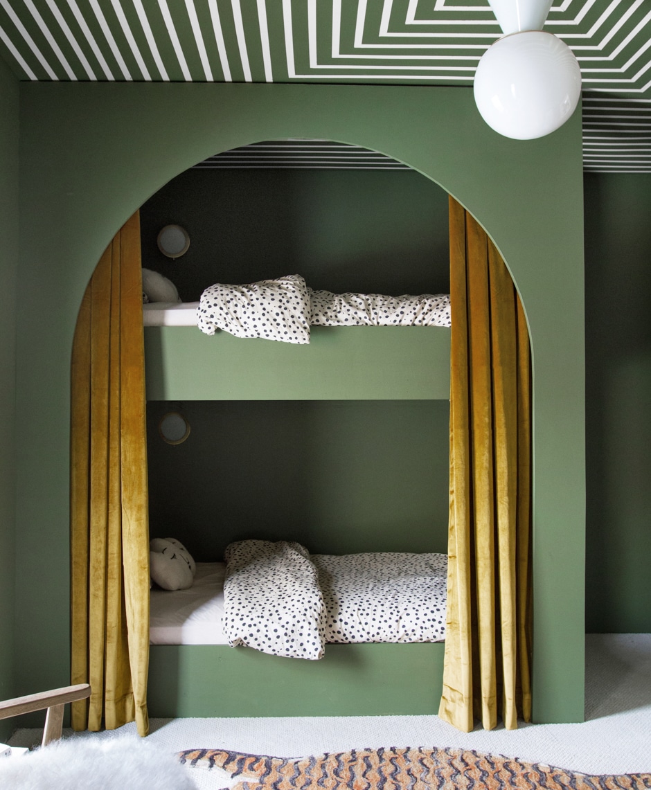
The New Neutral: Earthy Greens
Designer Sarah Sherman Samuel is a trendsetter when it comes to color. Back in 2014, her gray-green kitchen inspired legions of copycats, and when she leaned into blush pink for Mandy Moore’s Los Angeles home, it helped solidify Millennial Pink’s place in interior design. So it’s no surprise that the design for her son’s bedroom predicted the latest color trend: earthy greens everywhere. In a year when we’ve spent more time inside our own homes than out, natural colors would be trending, says Samuel: “Now more than ever, people are finding that a connection to nature is calming and nurturing.” Plus, this shade is quite literally nature’s neutral—it goes with just about anything.
By Laura Fenton | Green ceiling photograph by Natalie Papier | Architectural detailing photograph courtesy of The Direct Painting Group, by Joshua Mchugh, Danielle Nagel, and Reid Rolls | Macro-color-blocking photograph by Hilton Carter | Limewash photographs by Pablo Enriquez, Jessica Alexander, Julie Pointer Adams, and Michael Clifford | Earthy greens photograph by Sarah Sherman Samuel