Brian Patrick Flynn’s Mid-Century Do-Over
At the holidays, designer and HGTV host Brian Patrick Flynn brings an “eclecticist’s eye” to decorating the Atlanta home he shares with his husband and two rescue dogs.
The first time Brian Patrick Flynn, host of HGTV’s Dream Home and Magnolia Network’s Mind for Design, walked through what would eventually become his home, it was to meet with the client who lived there. Ruth, then in her 80s, hired Brian to renovate the basement of the house she and her husband built in 1965 as a place to raise their kids.
From his first visit, Brian loved the mid-century modern home—a rare style in Atlanta. “She told me, ‘I will only sell this house to the right person, someone who appreciates it, and if you want it when it’s time for me to move out, it’s yours.’” Five years later, in 2015, Ruth made good on her promise.
Once he owned the house, Brian knew the first thing he’d need to do was to bring in more light. The place was stunning but dark, with low, eight-foot ceilings that made the place feel like a cave. “The most important design element to me in any space is natural light, because it creates the mood in every room in the house,” he says.
“Windows and doors are expensive, but letting in more natural light is the most important element of design, because it creates the mood.”
—Brian
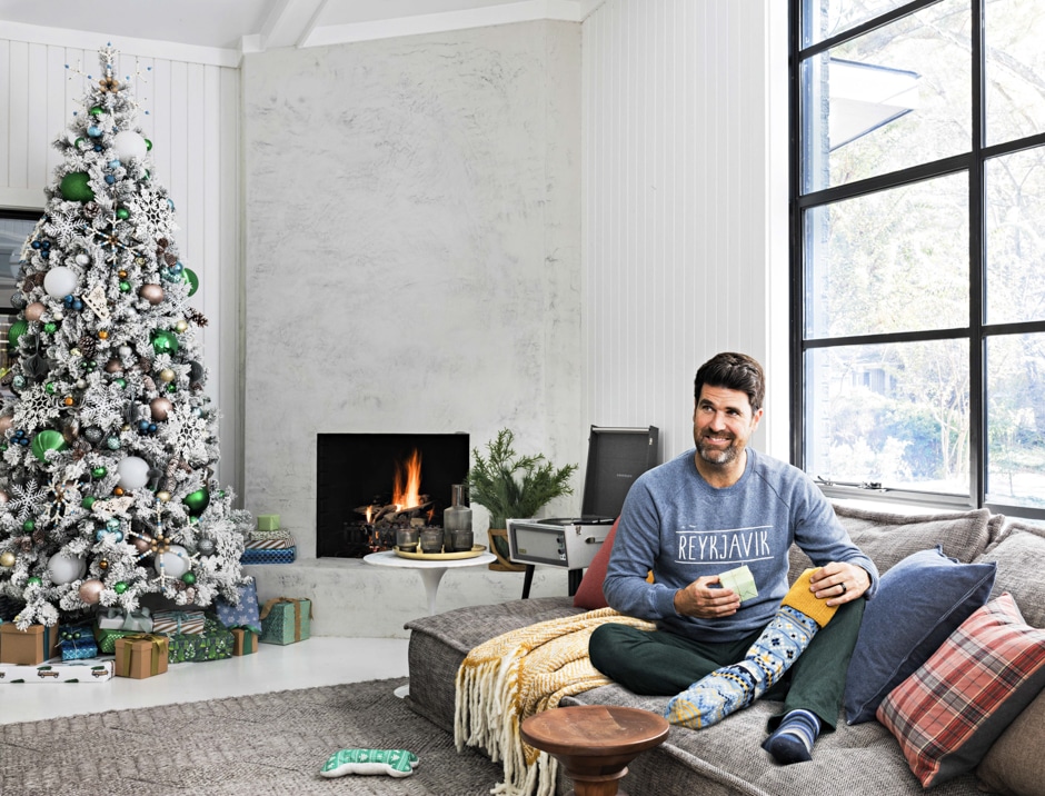
The designer knew that would mean adding skylights and replacing all the doors and windows to let in more light. “Those make the biggest impact…and of course they’re also some of the most expensive, messiest changes you can make to a brick exterior!” Now the contemporary black steel-frame windows are one of his favorite features of the home.
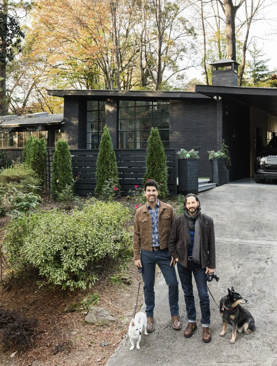
Along with his husband, Marvel costume designer Hollis Smith, Brian renovated room by room over several years. Through each change, their goal was to make the home feel “authentically 1965, but adapted for how people live in 2021.” A great example of this is the mid-’60s record player they adore for both its period-accurate technology and its rich, textured sound.
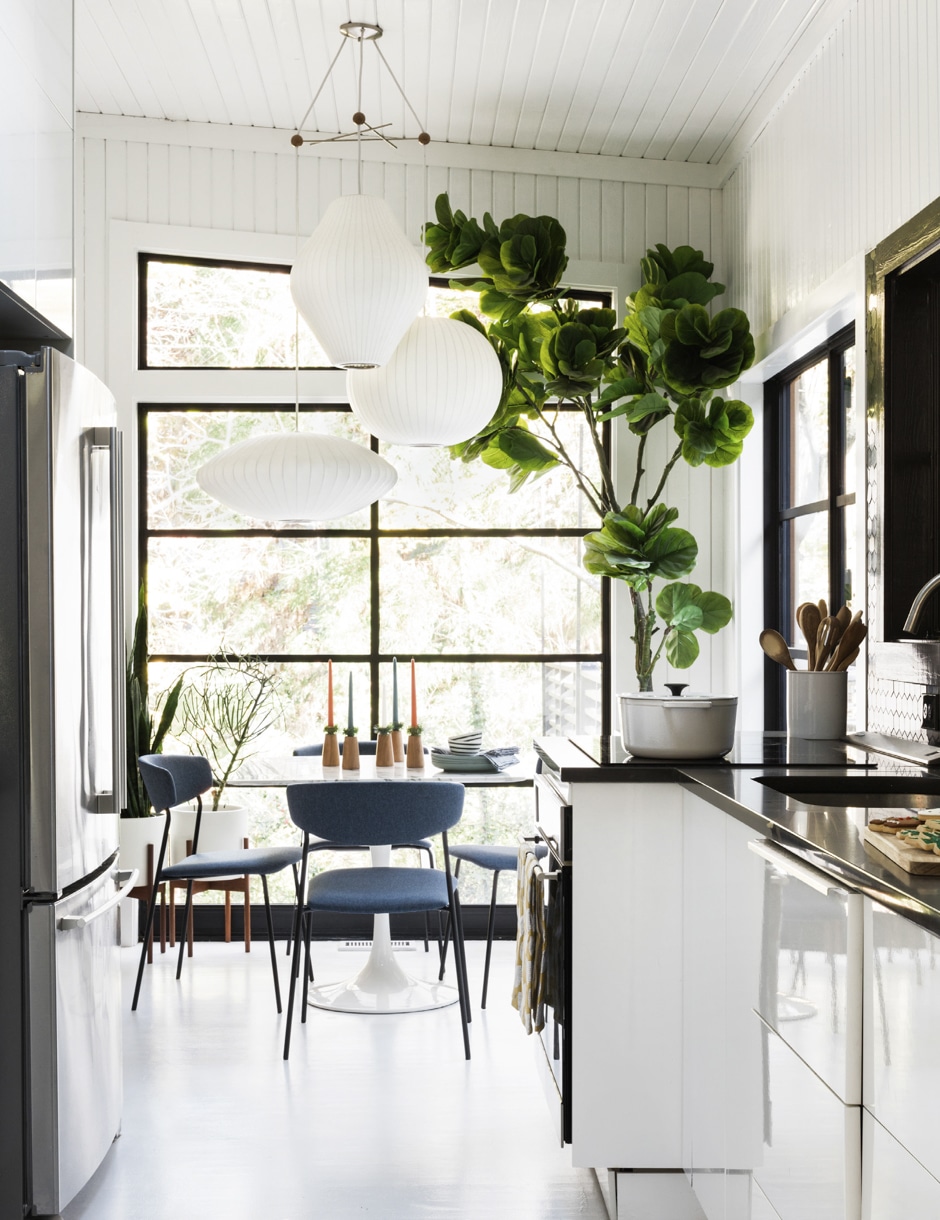
A similar theory guides how Brian decides which pieces in the home to buy new and which should be originals. “For lighting, like the George Nelson bubble lights in our breakfast nook, I’d rather have reproductions because we’re away a lot for work or vacation, and I don’t want to worry about fires from old wires,” he says. “For something like furniture, 90 percent of it is vintage, which I usually find on Instagram.”
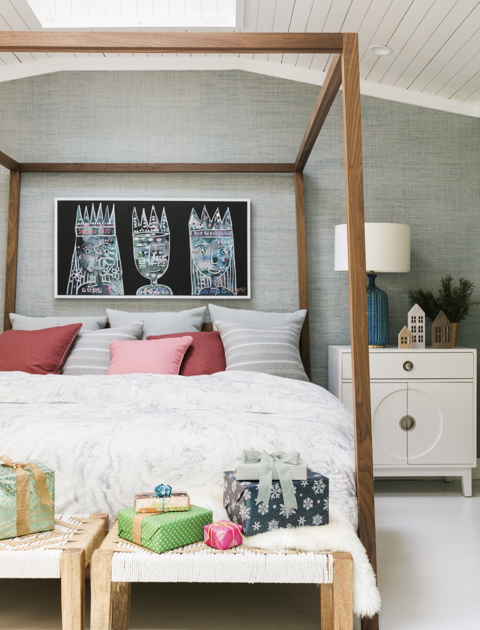
Same goes for the retro walls: Because drywall was out of favor in the ’60s, and textured, beige wall coverings ruled, he papered the main bedroom in raffia, but updated the color to a more contemporary blue-gray.
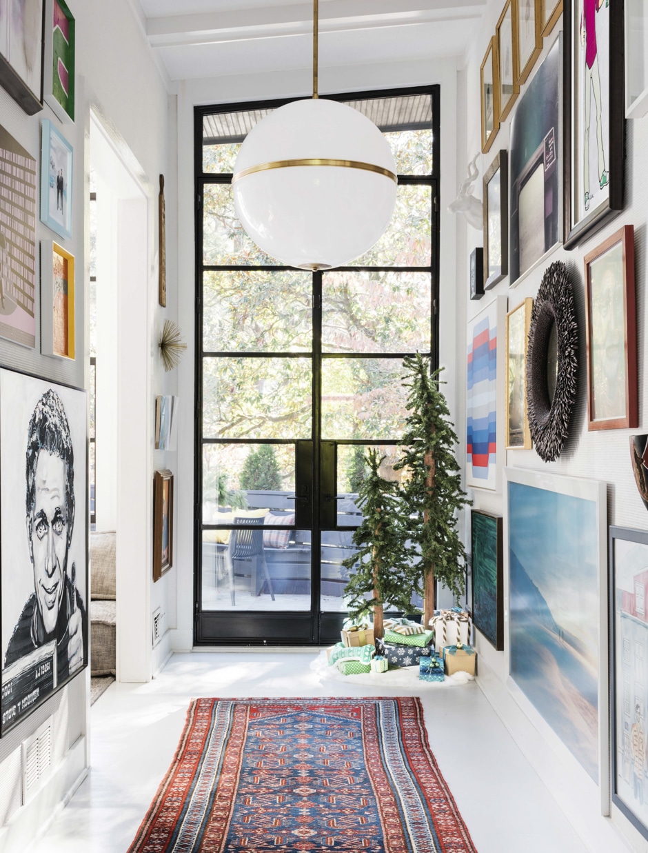
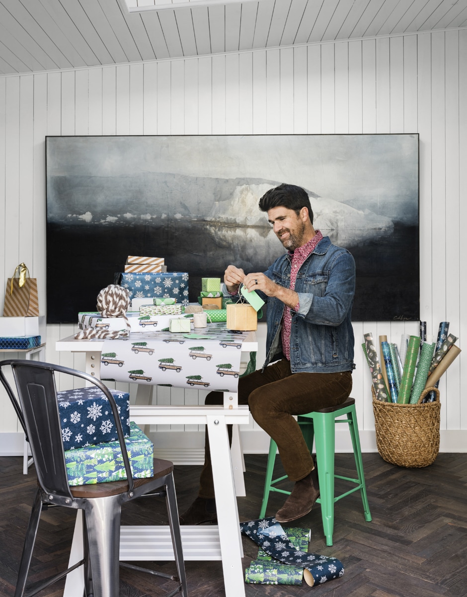
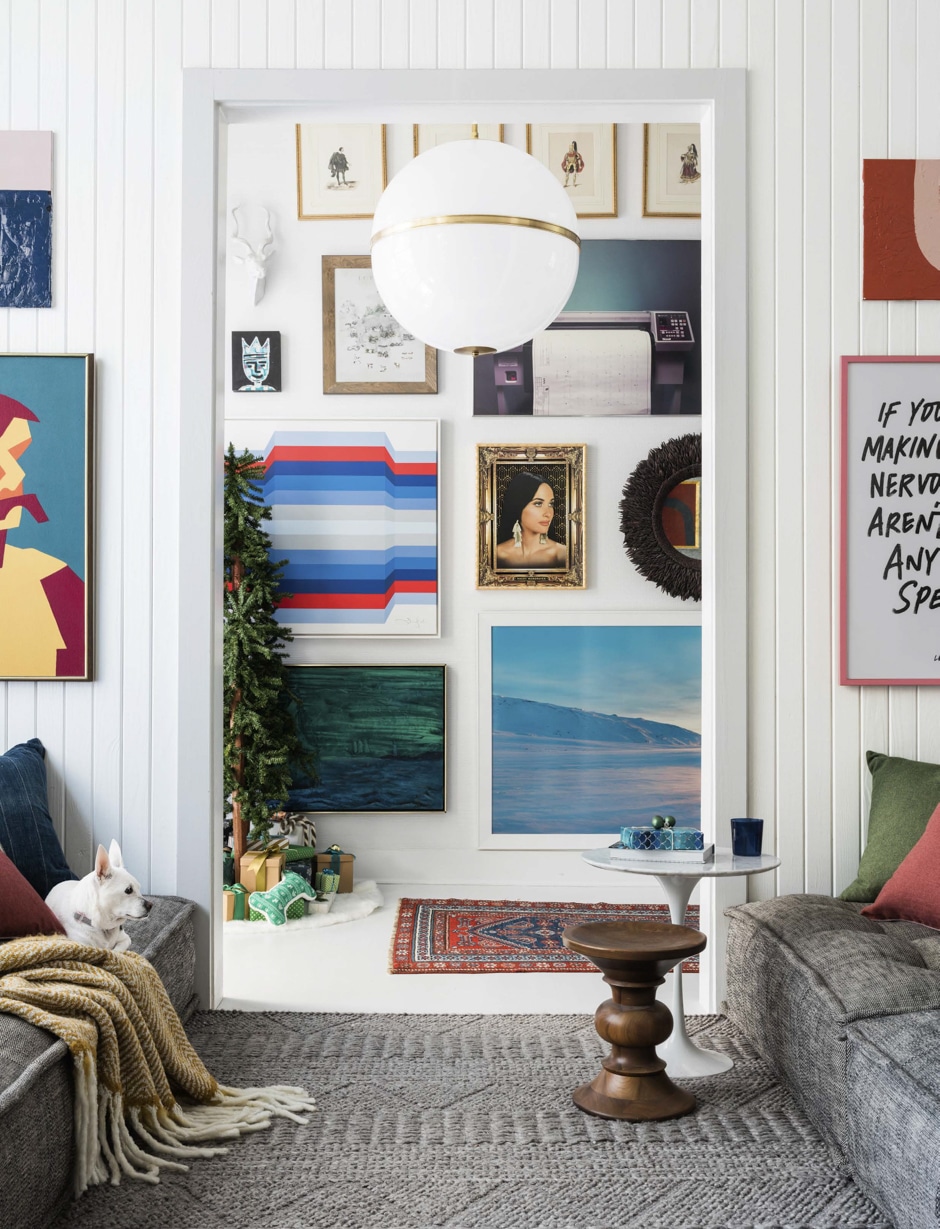
But Brian’s not all about neutrals. He adds bright color through gallery walls in the hallway and living room. “They’re all pieces that mean something to us from our lives or our travels, and I go out of my way to make sure there are all different colors and different frames. I have an eclecticist’s eye,” he says. Brian even worked a surprising pop of color into his holiday decorations. “I love decorating my tree with green, blue, and orange ornaments. It’s so unexpected,” he says.
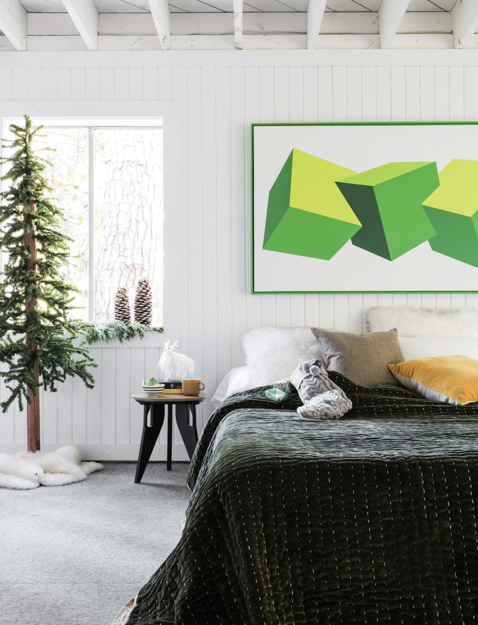
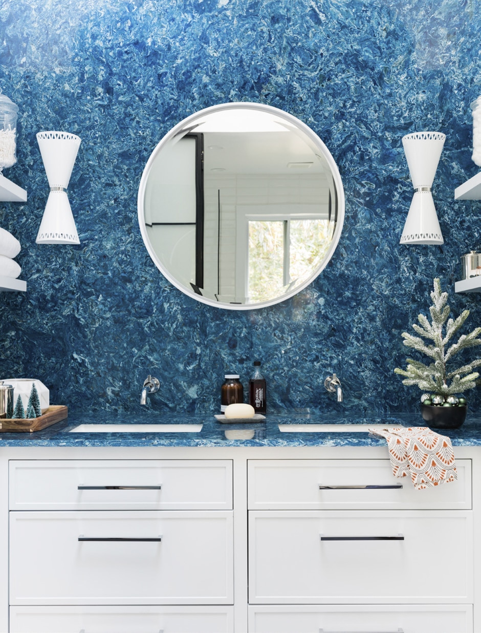
A lot of the experimental fun the couple had during the reno was making over the guest suite. They tried out new ideas like neon-green art above the bed in place of a headboard, as well as covering both the wall and the countertop in the en-suite bathroom in bright, bold engineered quartz, which suggests pool water. “It’s by far the riskiest room in the house,” Brian says. “But I like to use my space as a sort of design lab to play around with new ideas, and it makes sense to take a risk in the guest area because that’s where we spend the least amount of time. Anyway, our guests love it!”
One recent guest, however, offered mixed reviews. When they invited Ruth, now 96, over to see the changes to the home she’d built, the response was mostly positive, says Brian. But “she said she liked her old kitchen better!”
By Sarah Z. Wexler | Photographs by Robert Peterson