Behind the Scenes: Our Most Colorful Issue Yet
How we mixed this issue.
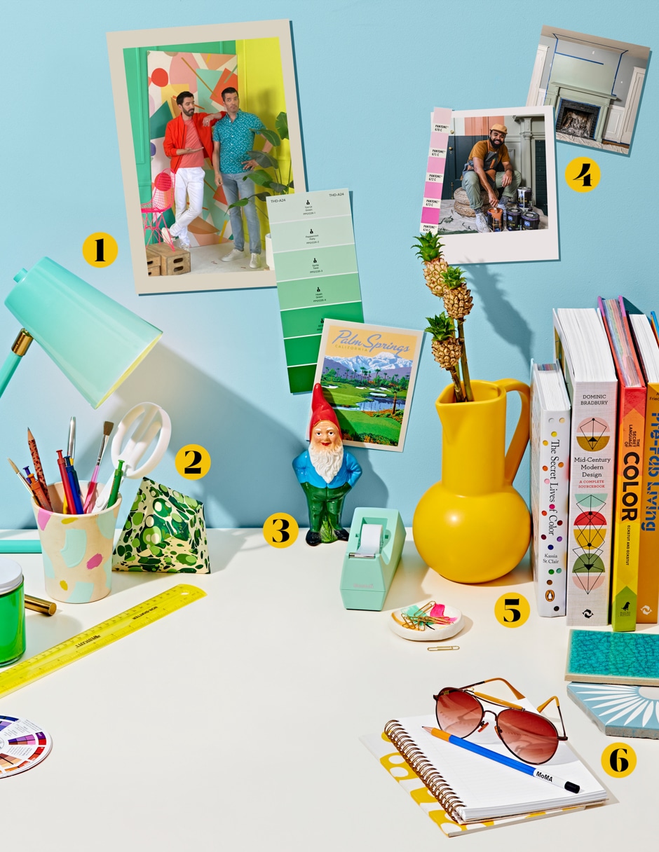
1. Our cover backdrop blended Astek’s funky Misshapes wallpaper with Benjamin Moore’s minty Adam Green and lemony Limelight paints.
2. We love that a paperweight can inspire a designer who inspires us. Hear from @younghuh on page 24.
3. The Amélie story on page 32 made us so nostalgic for the film that we got a replica of the gnome in it for the office!
4. Plant guru @hiltoncarter also has a knack for color combos. See proof on page 78.
5. Colorful books about color—so meta! Find bright ideas for your shelves and other spots in our 20 Ways To Add Color To Your Life feature.
6. We wanted our tile guide to shine. See some beautiful options on page 38.
Making this issue was so much fun—what creatives don’t love to play with color? The key was packing the pages with the brights currently flooding home design without turning the corner into juvenile. (Funny, it’s the same rule we’d apply to decorating a room. Unless it’s, um, a kid’s room.)
We highlighted spaces with color built into the look: Wallpaper! Paint! Bold printed and solid textiles! We also added neutrals to avoid overdoing it with wall-to-wall Day-Glo. Whether it’s the gorgeous paint tones or the smallest design details, we hope you’ll take inspiration from this issue and flood your life with happy color.
By Reveal Editors | Photograph by Ted + Chelsea Cavanaugh